


Looking for Low Brokerage, High Margin & Free Tips?
Seasonality Charts
| | Charts | No Comments
More on Charts
Seasonality charts are one of the popular trading tools of modern times. Yes, there is an abundance of trading tools out there, each with its own proposition and business value to the user. Furthermore, such tools have an optimal time-spot when they must be used and when those can be avoided.
Seasonality can be attributed to the specific nature of the stock that shows recurrent fluctuations in a particular interval, and there is a possible chance of it performing in a way which is consistent with the previous results.
The said tendency can be anything, ranging from weather conditions (temperature in summer v/s temperature in winter) or calendar events (quarterly report announcements). Even though several factors influence the market, specific events and conditions occur at annual intervals.
The annual cycle of recurrence of events give rise to seasonality phenomenon and reflects in the seasonality charts.
Seasonality charts help the traders and market enthusiasts to determine how often a stock rises in every month of the year. These charts hope to answer the most important question every trader faces and this:
When to enter and exit the market?
Seasonality Charts Mechanism
We have all possibly heard about the famous ‘Sell in May and go away’ investment strategy. If you have not, it is fine too – we will touch upon it in this review.
The direct implication is that there is an expectation that the investors should ideally be exiting their positions in May so that they can avoid the seasonal drop. The theory was developed on the basis that few stocks underperformed in the 6 months starting in May and finishing in October. Thus, these 6 months can make or break the deal for you!
It is not based on a blind shot.
Although we are talking in the context of Indian Share Market, however, to understand this concept, let’s take a leaf from the US stock markets. If we see the past records of Dow Jones Industrial Average from the year 1950 to 2013, you can observe that the average return is only 0.3% from the months May to October as compared to 7.5% from the months November to April.
Isn’t that surprising (if not shocking)?
And this is where seasonality charts come in as they offer you a better picture for investment. These charts will give you an exact idea to decide on the time for investing and offloading the securities.
Any expected change that occurs in a regular interval on an intermittent basis during one year can be classified as a seasonal change. In simple terms, seasonality charts show the tendency of the stock to perform better in some period than others. This period can be weekly, monthly, quarterly, and half-yearly or even multi yearly.
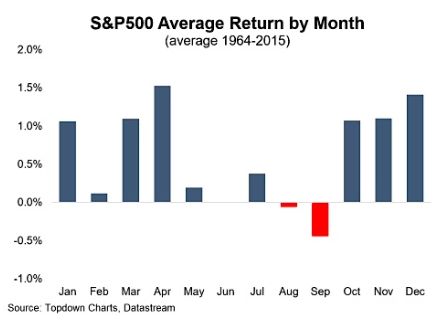
The seasonality charts calculate two important numbers – the average gain/loss occurred during the month and percentage of time in the month, the results were positive. Given below is a classic example of a seasonality chart of the stock market.
The period of the above chart is for 51 years, i.e., 1964-2015. We need to decide during chart drawing that if the period selection is more appropriate than if we selected a shorter period, let’s say 10 years. We can also make these charts for a shorter period, but according to practical experience, the longer period for the chart, the stronger would be the annual pattern.
By making the seasonality chart histogram, you can make clear observations on the market trend. For instance, the market does not make much movement between May to August. But it is also evident that markets are bullish in May and bearish in August.
We can also see that the stocks are in a strong position from October to April. As per the charts, the strongest month shows as April. It is the best time for a trader to enter the market. The best three successive months for stocks would be October, November, and December.
By reading this chart, we can easily infer how the stock market works on a monthly basis over the years. These charts give us a picture of the past. However, it is important to note that there is no certainty that this will equal to same future performance.
But by looking at these charts traders can create trading strategies on how to trade effectively and make the best use of these seasonal patterns.
You can find many websites offering free seasonality charts. For the construction of this chart, you first need to decide upon the date range or how much historical data you need. The date range can vary from today, last week, last fortnight, previous month, previous quarter to last year and even last 10 years.
Then the selected period will be displayed. Usually, the display covers all existing periods. After that, we decide upon the type of seasonality charts we want (histogram, same or separate scale chart). Then we will select the respective colours for positive and negative bars. The currency is selected, and so is the smoothing period.
When all the required information is provided, the website will display you with the chart of your need. Obviously, it is not possible for market behaviour to always coincide with these charts. The market is dynamic, and numerous factors affect its performance.
However, it can provide potential insight into recognizing bullish and bearish periods.
Seasonality Charts Example
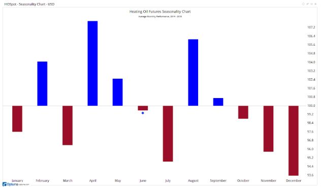
There are basically three types of seasonality charts – histogram, same scale, and separate scale.
Given above is an example of a seasonal histogram chart for 5 years of HO Spot Company. We can see that for the past 5 years, the company has done exceptionally well in the months of February, April, and August.
We can not expect the events happened in the past will repeat in the same time again in the next year or month, but it indeed provides that extra level of confidence to the traders.
The seasonality chart has got a histogram bar for every month of the year. The number decides the height of every bar denoting the stock appraisal.
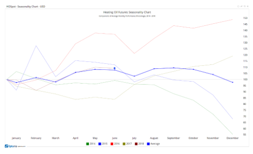
Given above is the example of a seasonal chart in the same scale style for 5 years, i.e. from 2014 to 2018 in different colours. This style shows the line chart for each year in consideration. It would help the traders to compare the performance of stock on a yearly basis.
As you can see that all lines start at 0 per cent which means the percentage change calculated is over time and not over price. Also, it is clear that 2016 is the best year in terms of performance when we compare all 4 complete years. 2018 line is work in progress as at the time of drawing the chart; the year had not ended.
Regarding performance, 2014 is the worst year.
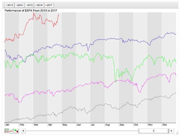
Given above is an example of the seasonal chart on a separate scale basis from the year 2013 to 2017.
Similar to the scale chart, the lines are presented for each year one below the other so that it is easy to make a comparison. The line for the year 2017 is still in progress as the chart had prepared during the end of April 2017. Also, it can be clearly seen that out of all the completed years, 2016 was the best one whereas 2013 was the worst one.
Seasonality charts are useful to determine when to enter and exit the equity market, but they are not precise. Traders need to use technical analysis for optimizing the result. Some of the technical indicators that can use with seasonality charts are Moving Average Convergence Divergence (MACD), Stochastics and Relative Strength Index (RSI).
These indicators will give you entry and exit signals shortly after reaching a short-term high or low.
Seasonality charts Benefits
Here are some of the top benefits of using the seasonality charts in your trades:
- These charts are very easy to draw. You can find many online sites offering free seasonality charts preparation services. Once you feed all the inputs, your chart will be ready in moments.
- Seasonality charts are also simple to understand. There is no complex technical knowledge required to understand the developments. These charts are easy to follow and analyze.
- These charts are made by using verifiable data and hence are accurate and reliable.
- Seasonal charts help to guide traders on when to enter and exit the market.
Seasonality charts Concerns
At the same time, here is a concern you should know of when it comes to seasonality charts:
Nobody can assure the accuracy of seasonal charts. Just because there exists a specific pattern in the past, it doesn’t ensure a similar occurrence in the future.
Since the stock market is unpredictable, and it is hard to guess the way the price of security is going to move. These charts though can enhance the confidence of users but relying on it 100 per cent is not advisable.
In the ending thoughts, we would like to reiterate that Seasonality charts are a great way to assume the best movement possibilities of securities by comparing its previous years, months, and day’s trends. These charts use inputs based on the past performance of the stocks, which had an excellent profitable turn out during certain months of the years.
Just like the seasons we experience (summer, autumn, spring hand winter), stocks also got different seasons. Even though these seasons are not as accurate and reliable as seasons we have in the real world, they still can be studied and analyzed by traders to decide his/her entry or exit from the security or the stock market.
Seasonality charts are also considering as important trading tools because they are simple to read. They use real cumulative historical information and are a great way to understand the market and how it operates
Just like several other things in life, stocks also work on a seasonal basis. By contemplating the seasonality of these in your trading research, you can make more informed decisions.
If you are thinking to start investing in the share market, let us assist you in taking things forward for you:
Summary
Reviewer
A Digital Blogger
Date
Broker Name
Seasonality Charts
Overall Rating
