


Looking for Low Brokerage, High Margin & Free Tips?
Three Line Break Chart
| | Charts | No Comments
More on Charts
Trading is basically the act of buying and selling financial products on the stock market, based on the trader’s assumptions. But how does the trader make these assumptions? A trader reaches to the assumption by the effective utilization of the market knowledge and by using the technical trading tools.
For instance, the Japanese trading charts (candlestick charts) have gained popularity in recent years due to their simplicity and ability to offer clear signals.
Three Line Break Chart Basics
From a similar thought process, other such Japanese charts widely in use by the traders are the Three Line Break Charts.
This particular Candlestick chart type was developed in the 18th century in Japan and was used for trading rice. With time, people found that these were effective for financial instruments as well. The chart introduced in the USA by Steve Nilson, through his book, “Beyond Candlesticks.”
Just like other Japanese charts such as the Point and Figure Charts or the Kagi Charts, the Three Line Break Charts also disregards the time factor and targets the price movement of securities.
Let’s dig a bit deeper from here and understand the mechanism of these types of charts, how do they work with the help of a few examples before we finally discuss the pros and cons of using them.
Three Line Break Chart – How it Works?
The Three Line Break Chart only makes a move when the price of the security moves a specific amount. Yes, you can say that it is quite similar to the Point and Figure Chart. Even then traders prefer it more because of its added benefits. In fact, many traders also call this chart as the improved version of the Point and Figure Chart.
Want to know how? Keep reading ahead!
The Three Line Break Chart uses a sequence of vertical black and white lines or green and red lines. The white/ green lines signify the rising price of the security whereas the black/ red lines mean the exact opposite i.e. declining prices.
As long as the price moves in the same direction, the same colour line will keep adding to it. Simple, right?
Price tends to continue moving in the same direction until a reverse swing occurs. A reversal in this chart happens when the closing price of the security goes beyond the high or the low of the previous three lines. The given chart does not take intraday price movements, but it focuses on the closing price of the day.
The chart adopts this method based on market evaluation, and it has found that the closing price is the most dependable factor in forecasting the price indication.
As you can already guess, the name of this chart comes from the chart itself. You have to break three lines before a reversal can happen.
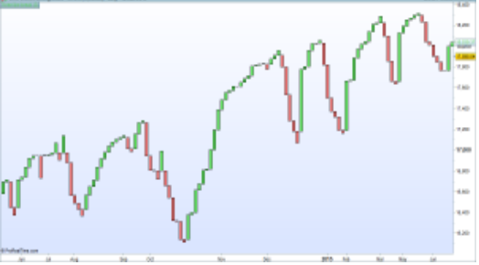
Given above is a classic example of a Dow Jones three line break chart with green lines representing rising prices of security and red lines representing falling prices. It is a breakout chart which means it only shows the significant movements of prices.
At the same time, marking of the reversal block happens only when there is a significant change in trend. It occurs when the price moves opposite to the current direction by an average of 3 blocks. However, the average of 3 blocks is possible to change according to the needs of the trader.
As you can see from the chart, each of its columns comprises of a single block– an up and down block, and a reversal up and down block. Reversal blocks will every time be longer than the previous 3 blocks of the previous trend.
Getting confused? Suggest you read the last 3 paragraphs again for a clearer understanding.
One of the reasons why traders prefer this chart is that the reversal amount is not fixed or calculated using some mathematical method. It occurs due to market fluctuations. Traders usually like to enter the market only after the reversal of trend happens.
Three Line Break Charts Example
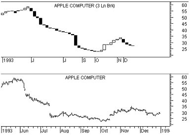
Given above is the example of a Three Line Break Chart of Apple computer along with its bar chart. The black and white bars are known as the lines. As already mentioned, these lines do not depend upon the high low range but the closing price of the security.
You can clearly see here that the number of lines in any particular month depends on the price movement during that month. For instance, the month of June has several lines as there were significant price changes; whereas, in November, only 2 break lines are visible as price changes were not substantial enough.
The standard trading rule associated with the Three Line Break Charts is that trader should buy when a white line comes up after 3 consecutive black lines, and he should sell when a black line comes up after 3 successive white lines.
The trader should ideally also avoid trading in a market which appears to be trendless with lines switching between black and white. Given the above suggestion, it would be better for a trader to wait until there is at least 3 repeated lines in one direction.
The rule is also applicable to reversal block and the trader should take a call to exit or enter the market accordingly.
Using the 3 Line Break Charts with other chart indicators are very easy. You can easily create the double top pattern, double bottom pattern, ascending triangle pattern, head and shoulders pattern and other patterns on these charts.
A chart pattern that goes great with 3 Line Break Charts is the Candlestick Chart. Even Steve Nison, a leader in Candlestick charting, in his book recommends using these two charts in conjunction with each other.
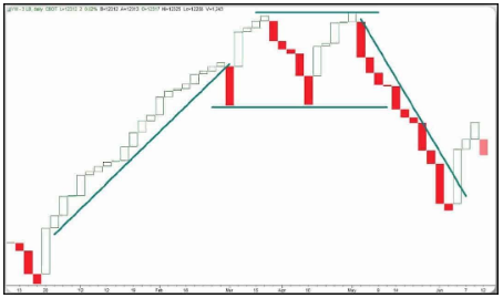
Given above is an example of a Three Line Break Chart used in conjunction with the traditional Candlestick Chart. This chart points very well towards the formation of a double top and double bottom.
A line which closes above or lower of this channel will provide us with a strong view for going short or long, and height of the channel can be used to guess the target for the movement.
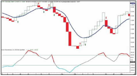
The Three Line Break Chart can also use in conjunction with standard technical analysis tools. The above charts illustrate how a technical indicator can use with a Three Line Break Chart. Here the Three Line Break Chart used with Exponential Moving Average (EMA) and Commodity Channel Index (CCI).
In this above system, a trader will go long when either CCI surpasses (-100) or when a white line crosses the EMA. Similarly, the trader will exit if the CCI exceeds below +100 or when a red line crosses the EMA.
The Three Line Break Chart also provides the traders with clear highs and lows, which they can use as a base to understand the support and resistance levels.
But what are support and resistance levels and how are these tools useful in trading?
Support and resistance are specific price points of any chart which is a deciding factor to attract the maximum amount of buying or selling. At support price point we can expect more buyers than sellers, whereas, at resistance price, one can expect more sellers than buyers.
Support and resistance points not only help us to understand the market in a better way, but it also helps traders in planning their stop loss level and their profit targets.
Three line break charts Advantages
Here are some of the top benefits of using three line break charts in your trades:
- Three Line Break Chart only shows significant price movement and filters out any unnecessary noise from the market.
- Default or other such methods do not set the reversal amount, but its base is current market actions.
- The chart can be used easily in conjunction with other technical indicators for better decision making.
- Significant highs and lows can be spotted easily.
- The chart is easy to understand and use.
Three line break charts Disadvantages
At the same time, there is a grey side of using these charts as well. Here is why:
- Just like other Japanese trading charts do not consider time for charting, the Three Line Break Chart also has major shortfalls. In Three Line Break Chart, the signal forms way later than the occurrence of the new trend. This leads to lagging and delay in signals which can create problems for the traders.
Conclusion
Just like its Japanese counterparts, the Three Line Break Chart also ignores the time factor while plotting the chart. The practice helps in filtering out the unwanted noise and traders can focus their attention on significant price changes.
The ability to eliminate noise is also advantageous while identifying the trend.
Traders can evaluate the trend and take a call on whether to enter or exit the market and also make a decision whether to buy or sell the securities. Traders also prefer this chart, as it generates a market-based reversal amount and not formula based, which provides a more realistic market picture.
Usually, the size of the reversal block generates in 3 blocks, but you can change it to 2 line breaks or 4 line breaks according to the requirement, but traders usually go for 3 line breaks due to its accuracy. The chart can also be used along with other technical indicator tools for increased advantages and more understanding of the market.
The Three Line Break Chart is a highly reliable trading tool, and you can benefit enormously with it if you know how to use it correctly and also use it along with other similar trading tools.
If in case you are looking to get started with stock market trading and using these types of charts in your trades, let us assist you in taking the next steps.
Summary
Reviewer
A Digital Blogger
Date
Broker Name
Three Line Break Chart
Overall Rating

