


Looking for Low Brokerage, High Margin & Free Tips?
Renko Charts
| | Charts | No Comments
More on Charts
If you are an active trader, you would probably know that no single specific formula can be used as a bulletproof solution to reap success. The nature of the market can’t be speculated, and that is exactly the beauty of stock/share trading.
But that shouldn’t stop you from making use of different trading tools that can ensure you profitable results and help you to understand the market in better ways.
We have got numerous such trading tools for you, and in this article, we are going to discuss one of them – the Renko Charts.
Renko charts are used by traders to track price movement of all assets, be it stocks, commodities or any currency pair. These charts will remove negligible price fluctuations.
Because of this elimination, trends in prices are way more natural to get recognized, and as opposed to more traditional charts like candlestick charts, the appearance of these charts are also more uniform.
How do Renko Charts work?
Renko is derived from the Japanese word renga which means brick and was popular in Japan before being brought to the West by Steve Nison via his book ‘Beyond candlesticks.’ It is a chart based on price movements of security and is independent of time.
This needs to be known that Renko Charts does not consider the time factor and that is why it is a suitable trading tool for position or swing traders rather than intraday traders.
Renko charts are akin to three line break charts and Kagi charts, but they are of fixed size and are created in the direction of the primary trend. The chart comprises small boxes or bricks with no upper or lower shadows. So, the box sizes have a fixed appearance.
The greater the size of the box, the chart will exhibit less movement yet one can notice greater stops on the positions. If the trader uses the box size that is too small, that will lead to excessive sensitivity to the changes of price, and hence it is not advisable.
While there is no perfect box size one can select, traders usually set it as 1% of the price of the security of daily Renko charts.
The smaller the size of the boxes, the greater will be their number and vice versa. A new box appears on the Renko charts if there is a specific amount of movement of price. The box colour also will change only if the fixed box size has exceeded.
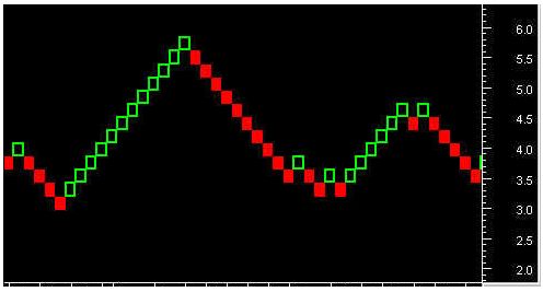
Given above is a classic example of a Renko chart. For constructing the brick/box, traders use two methods:
- Average True Range (ATR) – It is using as an indicator to gauge the volatility of stock price. The default period for ATR is set at 14 days. The ATR method automatically determines the brick size after calculating what the brick size would be in a regular candlestick chart.
- Set price range – Each box will have a fixed value set by the traders. It can be anything according to the need of the traders but should be able to capture the movement of security’s price. For instance, the security can set at a $0.25 brick size or a currency can set at 50 pip brick size.
In the above chart, the green bricks denote the upward price movement of the security, and the red bricks reflect the downward price movement.
The shift in the Renko Charts is simple to understand.
Let us say if the value of the brick has set at 5 points, then only a movement of 5 points or above can lead to the making of another brick. In the Renko Chart, the price fluctuations below to 5 point will be ignored, and it will not show any changes in the chart.
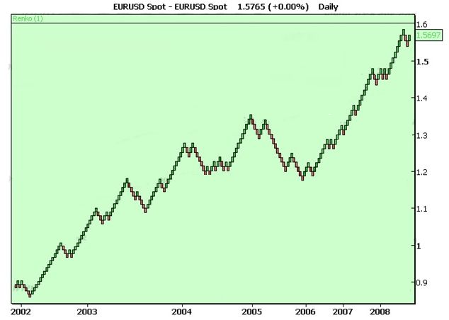
Renko charts Example
Given above is a Renko Charts for EUR/USD with the brick size set at 1. You can notice that it has not been configured with any time frame as this chart does not depend on it. The distance between different years given is also dissimilar, as the distance between 2002 and 2003 is lesser than that of 2003-04.
It happens so because more Renko bricks are formed in the latter period than the earlier one. The Renko charts are easy to understand and analyze. The user does not require much technical knowledge of trading charts or the markets in place. That is why it is used as a preferred means for the traders all over the world.
While forming the Renko Chart it is important to note that the bricks should always have their edges touching, and in any vertical column, it should not have more than one brick present. These bricks should form at an angle of 45 degrees from each other and are dependent on the closing price of the security for that period.
Hence, if the price of the stock rises $1, then it forms an up box. Similarly, the price of the stock must reduce by $2 for the construction of a down box.
The Renko charts can easily be used in combination with other technical analysis. They can be applied for deciding the support and resistance levels, determining exit and entry point in the market, recognizing breakouts and so on.
The utilization possibilities are wide open because there is less noise in these charts when compared to other traditional trading charts.
For instance, a Renko Chart may be beneficial in recognizing the prevailing trend. But for finding the exact exit and entry points, you should use technical indicators and a candlestick chart. It is quite a peculiar situation with Renko Charts, as you don’t get significant details of movements while comparing with other charts.
Again, this is because the Renko Charts don’t depend on the times of the price movement. It uses a single brick to mark the security exhibiting continuous sideways trends for an extended period by not emphasizing the importance of price movements.
When there is a change in the direction of the trend, it will usually generate trading signals, and the bricks change colours. For instance, a trader may sell an asset when a red box forms at the finish of a sequence of rising green boxes.
As this chart aims as a means to track the trend of the price of an asset prevailing generally, it can often generate false signals in cases where the brick’s colour changes too soon, resulting in the formation of a whipsaw effect. That is the reason why it’s vital to use these charts in combination with other types of technical analysis methods.
Furthermore, a Renko Chart is also handy in recognizing Fibonacci Retracement Levels as it eliminates any unwanted noise from the market. The Fibonacci level is a standard trading theory being in use for a long time.
And Fibonacci retracements are specific ratios which help to recognize potential levels of the price reversal. The most widely used rates are 38.2% and 61.8%. These are also usually applying to estimate the length of a countertrend after a decline.
When used with other technical indicators, Fibonacci retracement becomes more powerful and useful. Therefore we advise you to use it along with Renko Charts for more efficient results.
But before we conclude this section, we’d like to tell you what a wick is and why is it important while analyzing Renko Charts?
A wick in the chart occurs when price actively tries to move in the opposite direction but couldn’t.
A Renko Chart with a wick or tail will provide traders with extra information concerning how high or low the price moved while forming the Renko bricks.
Renko Charts Advantages
Here are a few benefits of using Renko charts in your trading analysis:
- Renko charts eliminate noise from the market, and thus identification of trend becomes easier.
- They can use in conjunction with other indicators to provide traders with a critical and objective approach.
- It is a technical analysis tool with high competency.
- There is no need for redrawing of data.
Renko Charts Problems
At the same time, here are a few concerns you must be aware of while using these charts:
- Renko charts don’t take into account the time factor and the construction of these bricks are solely dependent on price movement. It leads to a delay in the creation of the bricks. It can take a few minutes to hours for a brick to appear on the chart. And if any consolidation occurs in the market, new bricks might not look for a very long time.
- Since the chart depends on the closing price of the security, the number of bricks moved can only determine after the closing of the previous bar.
Similar to Japanese Kagi Charts, Renko Charts are not dependent on the time factor.
They filter out minor movement of price so that traders can focus on significant trends. Traders love to use this chart because of its simplicity and easiness to understand. They are also an excellent method for identifying the support and resistance level.
If you are a trader dependent on candlestick chart types but want more clarity regarding divergence and trends, Renko Charts are the right choice for you.
However, we wouldn’t advise you to be dependent on Renko Charts alone. In fact, trading by using any single indicator is not a good idea. You can find no magic trading tool that can work in today’s complex market with cent per cent accuracy.
Because of this very particular reason, traders are using Renko Charts along with other trading indicator tools for having accurate movement results.
In case you are looking to get started with the stock market trading with a broker that provides assistance in share market analysis, then let us assist you in taking the next steps forward:
Summary
Reviewer
A Digital Blogger
Date
Broker Name
Renko Charts
Overall Rating
