


Looking for Low Brokerage, High Margin & Free Tips?
Relative Rotation Graph
| | Charts | No Comments
More on Charts
Relative Rotation Graph or RRG is a unique representation charting tool that is used to deal with Relative Strength Analysis and much more. Yea, you may be thinking, what is Relative Strength analysis in the first place?
Well, we will get to that!
By using the chart, you can make use of RRGs and analyze the relative strength trend between several securities based on a common benchmark. What makes the profound power of the tool is its ability to plot out the relative performance in one single graph and showcase the correct rotation at the same time.
When it comes to trading in the stock market, the RRG is used as a charting tool in order to track and identify investment opportunities. In this article, we are going to learn more about it and how you can trade using Relative Rotation Graph (not just trade but trade profitably).
Relative Rotation Graph Mechanism
In the year 2004-205, Julius de Kempenaer, while working as a Sell-Side Analyst for an Investment Bank in Amsterdam developed the Relative Rotation Graph and launched on Bloomberg in January 2011. This is was in order to visualize the relative strength within securities.
Furthermore, it was also released on a stock market analysis website in July 2014.
RRG chart is different from any other financial chart, and the horizontal axis in the RRG shall not represent time, unlike the regular charts. RRG does make use of four different quadrants to define with the four phases in a relative trend. Any kind of correct rotations can be witnessed in the form of securities, and it does move quickly from one quadrant to another over various time fractions.
Before having an in-depth look at the Relative Rotation Graph, two main inputs are required for proper examination, and they are JdK RS-Ratio and JdK RS-Momentum.
The fact to be noted is that both these input indicators are usually standardized, which means these indicators are expressed within the same unit of measure and do fluctuate above or below their same level. This type of standardization process means that the RS- Ratio value for various securities can be compared together by using the same benchmark.
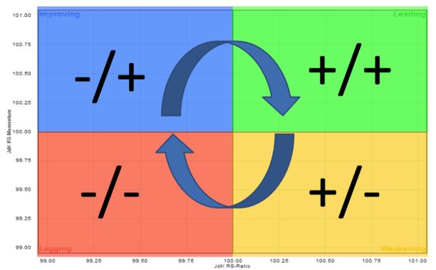
Relative rotation graph has four different quadrants as given below:
- Leading – In a leading quadrant, it shows a strong relative strength and a strong relative momentum
- Weakening – In a weakening quadrant, it shows weakening momentum with strong relative strength.
- Lagging – In a lagging quadrant, it shows weak momentum and weak relative strength.
- Improving – In an improving quadrant, it shows improving momentum with weak relative strength.
Tail length, graph scaling, and doing a close look at the chart period are some of the key points one must follow while using relative rotation graph for trading.
To create an RRG, one must typically have a minimum of about fifty data points collected for the daily RRG graphs, and about two hundred and fifty days of data for the weekly RRG.
RS – Ratio is obviously an indicator that tends to measure the trend for relative performance. Very much similar to the price relative, the RS-Ratio makes use of ratio analysis to create a comparison between the securities with another. It has been designed to dictate the trend concerning the relative performance and measure up the strength in that particular trend.
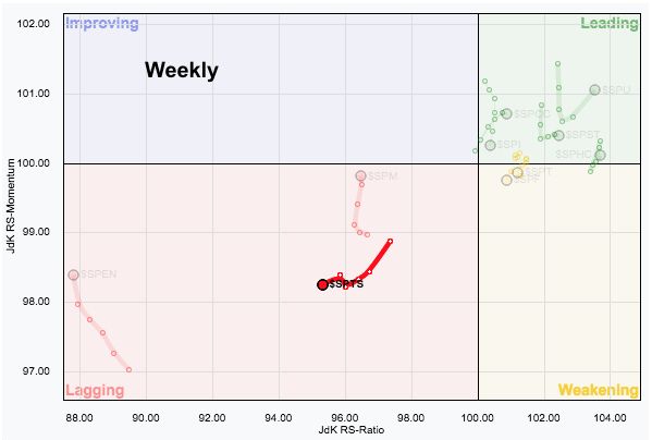
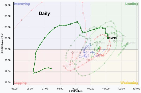
Relative Rotation Graph Weekly versus Daily:
When it comes to trading with relative rotation graph, you need to keep an eye on the line movements that definitely meets a difference every day. As with any standard bar chart, the line movements present in a weekly RRG shall look different when compared to the line movements presented on a daily RRG.
To explain this with an example, refer to the below-mentioned chart that showcases the weekly RRG levels way below the ($SPTS) S&P Telecommunications Sector within the lagging quadrant and is provided explicitly in red.
The daily RRG, on the other hand, is way more contrast to it, and it portrays the sector rotation away from the lagging quadrant and moving toward the leading quadrant.
Relative Rotation Graph Timeframe
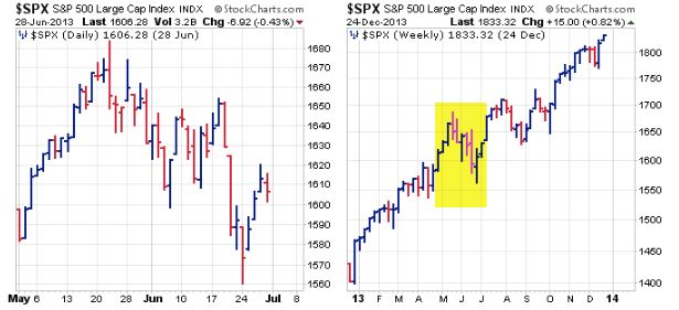
The chosen timeframe effects relative rotation graph just like the regular bar charts. Take a look at the below-mentioned example, where the first chart showcases daily data collected for two months, for the S&P 500, and you can find the two-month trend shows a downward trend.
The other chart showcases the weekly collected data for one year, and the entire trend shows an upward movement. The yellow coloured shaded area indicates the two months that are displayed on the daily chart to put down any type of decline into its perspective.
Clearly, it has to be noted as a short-term downtrend that usually happens within any long upward trend.
The chosen timeframe affects the relative rotation graph the same way. A sector that moves towards the weakening quadrant on a weekly timeframe, as mentioned above, shall stay within the leading quadrant on the daily timeframe basis as the sector is witnessing a short-term positive rotation.
This type of short-term rotation, on the other hand, is not powerful enough, but still, it can make a tremendous influence upon the rotation that happens upon the weekly RRG.
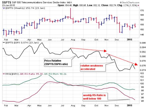
It can precisely clarify by having a look upon the RS-Ratio and RS-Momentum on the bar charts. Have a look at the first chart that showcases the weekly RS-Ratio and RS-Momentum, which preferably corresponds to the weekly RRG plot.
Another chart showcases daily RS-Momentum and RS-Ration, portraying the daily RRG plot. Have an eye on the weekly indicators presenting a long-term downtrend regarding relative performance and the momentum also stays negative. On the other hand, the daily indicators have turned up and even moved about 100.
By assuming that the weekly rotations are happening way stronger than the daily ones, and the rotation is said to be following an ordinary clockwise course, one can expect its positive rotation that happens in a daily timeframe remain temporary for a certain period.
During such normal rotation, the sector shall move towards the leading quadrant and cross between the weakening quadrant, and later on push it into the other lagging quadrant, by keeping the movement solid within the lagging quadrant on any weekly timeframe.
In other words, the daily move is definitely a short-term hiccup.
One needs to study about different timeframes to get to know about the entire picture and ways to trade with the same.
Relative Rotation Graph Rotation Sequence:
The arrows presented in the below-mentioned model relative rotation graph showcases the idealized rotation and is a clockwise one. In the graph, you can find that a sector happening within the leading quadrant (mentioned in green) and followed by an idealized rotation.
Make sure to remember, the RS-Momentum is said to be the leading indicator here, and it will be the first one to turn.
The relative momentum shall level off the leading quadrant from the beginning, and the RS-Momentum shall move below 100, which shall cause the sector to move way into the lower part of the right-hand quadrant.
The extended weakness within the relative momentum shall ultimately have an effect on the trend in the relative performance, and the RS-Ration shall move below 100, resulting the sector to face a lagging quadrant (mentioned in red).
The very first sign of strength can happen once it lies within the lagging quadrant, and it shall denote as an improvement regarding relative momentum. When the RS-Momentum moves and crosses above 100, the sector shall face a movement into the (blue in colour) leading quadrant.
A segment in the quadrant still faces a downtrend regarding relative performance, yet, the RS-Momentum is said to be improving and shall foreshadow making a move into the (green in colour) leading quadrant.
The extended strength that happens within the relative momentum shall ultimately have an effect on the trend concerning relative performance and the RS-Ratio shall move above 100. It indeed shall push the sector into the (green in colour) leading quadrant, and moreover, the cycle shall repeat again anytime.
Relative Rotation Graph Pros:
Here are some of the positives of using Relative rotation graph in your trading analysis:
- Can be used to determine with daily or weekly based charts
- Easy to follow up
- Will bring in a massive difference while trading in future
- Rotation sequence exposes the reality.
Relative Rotation Graph Cons:
At the same time, here are a few issues that you need to consider as well:
- Not, all the time the graphs shall work in favour
- A closer look is always required.
Relative Rotation Graph Conclusion:
Relative rotation graph shall make it easier to separate the leading marketers from other market laggards. Being said so, the RRG shall save your time and money while you engage on share/currency trading, as RRG narrows the focus to various parts of the market that needs much attention for furthermore analysis.
The RRGs can be broadly tailored to suit any investing or trading style as they are known for measuring both the trend and momentum for relative performance. Traders, irrespective of the momentum, can focus more on the crosses in the improving quadrant or on the weakening quadrant. The trend followers shall concentrate on the cross that lies into the leading or the lagging quadrant.
You should be aware of all these relative performance indicators and must know the risk involved which may happen even if the rotation reverses or turns back. Once again to conclude, these relative performance indicators based on the relative rotation graph must be used in conjunction with other basic technical tools to get a clear picture.
In case you are looking to get started with stock market trading or investments, let us assist you in taking things forward:
Summary
Reviewer
A Digital Blogger
Date
Broker Name
Relative Rotation Graph
Overall Rating
