


Looking for Low Brokerage, High Margin & Free Tips?
Kagi Chart
| | Charts | No Comments
More on Charts
Kagi chart is one of the most popular charts amongst the day traders and in technical analysis. In this detailed review, let’s try to understand how you can use these types of charts in your trading and stock market analysis.
Furthermore, what are the different benefits and concerns you may have while using these charts?
Let’s try to understand all of that and more!
Kagi Chart Explained
You should know the Kagi chart if you want to trade more effectively and professionally in the securities and share market. Developed in the 1870s in Japan, they were initially used to track the movement of the price of rice.
Yes, Rice!
Kagi chart is very different when compared to the traditional charts like Candlestick charts or Bar charts as they are not dependent on time and volume. So instead of two variables plotted on the X and the Y axis (time and price), the price is the only consideration in the Kagi charts.
It helps to filter out unnecessary ‘noise’ in the market so that traders get a better understanding of the price trend.
Steve Nison, the father of modern candlestick charting, introduced Kagi Chart to the western world who spent considerable time in Japan understanding and learning this technique.
For traders who were dependent on the traditional charting techniques, this method opened a new arena of opportunities to understand the matrix of trading and they gladly welcomed it and started enjoying its benefits.
Kagi Chart Strategy
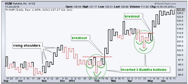
A Kagi chart comprises a series of vertical lines that look something like the following image:
As you can clearly see, this chart doesn’t look anything like traditional trading charts. Even though it provides a time aspect, the same is irrelevant to study this chart. The chart initially seems like a snake who is gradually making its way towards the right.
As already mentioned above, the Kagi chart uses a series of vertical lines which depict the movement of price. A horizontal line connects these vertical lines. The horizontal lines represent any change in the trend.
Each horizontal line depicts a high or low. A line moving from a low to a high is known as an up bar whereas a line running from a high to a low is called a down bar. These lines are also popularly known as Yin and Yang lines.
In the above-given figure, the green lines represent bullish periods (Yang line), and the red lines represent bearish periods, i.e. the Yin line.
The Green line implies that the market is in a bullish mode and the dominant upward trend is prevailing.
The red line implies that the market is in a bearish mode and the dominant downward trend is prevailing.
For drawing the Kagi chart, the first step is to calculate the reversal amount. Reversal amount is the minimum change of price required to make Kagi line move in the reverse direction.
Kagi Chart Reversal Amount
It has to be noted that the reversal amount should always be higher than the minimum move made and it could be divisible evenly, otherwise rounding errors might happen. There are primarily three ways which the traders use to calculate the reversal amount, which is given as follows:
- Percentage of price
- Average true range (ATR)
- Using a fixed point method
Average True Range:
Most traders prefer the Average True Range or the ATR method for this purpose. In this method, a 14-period value of ATR is using for the setting of the Kagi chart.
The reversal amount is of great significance for the traders because if they set this amount too high, they will end up missing out on many vital trades as they will be waiting for a change in the direction of the trend.
Traders prefer the ATR method as it takes into account the recent volatility of the security rather than just taking a specified amount or percentage for that purpose.
Percentage Price Method:
The percentage of price method makes a reversal to happen each time the movement of price occurs more than the percentage specified by you. It is advised for intraday traders to set the reversal percentage at 1% whereas the long-term trader should keep it at 4%.
A 4% setting of the chart will imply when the price reaches the level of 4% movement, there will be a change of direction accordingly. However as simple as this method might sound, it has some disadvantages. The main drawback is the inability to predict next reversal sweep about to happen.
Fixed Point Method:
The last method is the Fixed Point Method. By using this method, you can specify the number of points securities must reverse before there is a change in the Kagi chart line.
This method is very simple to understand, and it’s also easy to predict when the reversal is going to occur. However, you need to determine different point levels for the high-value stocks and the low-value stocks. Generally, traders choose the point to be approximately 1/20th of the average price of the stock. Points usually using are 2, 4 and 10.
The vertical lines tend to move in the direction of the movement of price, no matter how insignificant that movement is. However, when the price shifts in the opposite direction by a reversal amount, the horizontal line is made, and the vertical line gets constructed in the opposite direction.
Kagi chart Calculation
Given below is a Kagi chart for Citigroup Inc.
The rule to remember while trading via Kagi chart is that you buy the securities when the lines move from being thin to thick, and you sell the securities when it changes from being thick to thin.
As already discussed above, a lot of noise exists in traditional charts have consciously removed in Kagi, and hence it is easier to read and understand it. In the case of green lines, the connecting line is known as ‘shoulder,’ and in the case of red lines, the connecting line is known as the ‘waist.’
Or in simple terms, a shoulder denotes as a previous high and a waist as a previous low.
A thick line indicates that there is a dominant upside trend. This trend will remain in effect until the price moves below the previous low or as we call the ‘waist.’ Once the price moves below the waist, the thick line changes into a thin line which means that the uptrend is shifting to downtrend.
Now the dominant downside trend will break once the price moves above the previous high or the ‘shoulder.’
Kagi Chart For Intraday
With Kagi chart, using technical analysis is the best fit. You can use technical indicators such as MACD (Moving Average Convergence Divergence) indicator or Simple Moving Averages or Stochastics or EMA or RSI, etc.
However, one must know that only price based indicators will work with Kagi charts. The technical indicators are using because Kagi chart on its own can sometimes provide wrong signals.
Indicators are using to enhance the accuracy of these charts. Two of the most widely used indicators by the traders are RSI and MACD.
Let us first talk about the RSI (Relative Strength Index) indicator which measures the extent of current change in the price of securities and evaluates the oversold and overbought positions. This indicator can have a reading from 0 to 100.
So when traders use RSI with Kagi chart, they see if the RSI line is above or below 50. If it is below 50, it implies to sell the security, and if it is above 50, it is giving the trader the buy signal.
In the case of the MACD line, there are two lines-one is the signal line and the other is the MACD line. When the MACD line is below the signal line, it implies to sell the security, and when it is above the signal line, it means to buy the securities.
Kagi chart Benefits
Here are some of the benefits of using Kagi Charts in your stock market analysis and trading:
- Eliminates the noise from the market unlike other traditional trading charts like Candlestick or the Bar charts.
- This chart is exceptionally beneficial to traders in the trending market.
- Because it eliminates noise, these charts are not complex and very easy to read and understand.
- Kagi charts work excellently with the technical indicators
Kagi chart Concerns
Here is the other side of the coin and hence, some of the concerns associated with Kagi Charts:
- These charts do not work effectively in the choppy markets
- No Trend strength provided.
Kagi Charts Conclusion
The fact is, Kagi chart has survived all these years and have been widely using as a popular trading tool, and it tells you a lot about its effectiveness and importance. It provides a unique perspective on trading. The Kagi chart reduces the noise in the market, and it helps the traders to trade better and smarter.
You can use these charts exclusively or in conjunction with other charts and trading tools.
The traders should have a thorough understanding of the Kagi chart before using. However, it is important to note that using the Kagi chart do not provide an edge in the market for the traders. Price is unpredictable mostly and can’t be predicted correctly whether you use a Kagi chart or any other traditional trading chart.
However, by using the Kagi chart, you remove the unnecessary noise and can now understand the trend of the price movement in a better manner. We would recommend you to make use of the Kagi charts for not only enhancing your trading experience but also making better profits.
In case you are looking to start trading and investments, let us assist you in taking the next steps forward.
For more information about Stock Market Research and Analysis, you can check the following tutorials:
Summary
Reviewer
A Digital Blogger
Date
Broker Name
Kagi Chart
Overall Rating
